HEAVEN MEETS EARTH YOGA
-
A quick content audit revealed that competitive boutique studios in the area were beginning to up-level their creative marketing abilities online.
The UI of the website made it difficult to purchase offerings such as class passes, which were the highest-ticket revenue earning items.
After conducting staff and customer interviews, we realized our customers craved a safe space community space for healing and transformation.
We determined the best therapeutic color palette, fonts, and images that represented the brand, and prioritized updated the UI of the website.
-
Things I had in my toolkit:
-A grasp of the brand and the company mission, from conducting research and conversing openly with customers and employees
-A better understanding of the offerings my client was looking to create, as well as a contract and a timeline
-Positive relationships with the instructors, customers, and client that fostered trust
-An audit of the website and current social channels and paid advertisements
-
We saw steady revenue growth through Q2, Q3, and Q4. After 6 months of deploying a consistent content and messaging strategy, we witnessed a 38.9% Spike in revenue growth from May 2023 to November 2024.
This spike in revenue can be attributed to two sold out retreats, as well as the fact that both the Newsletter and Website refresh created ease-of-purchase, and social media and email promotional messaging promoted events and nurtured sales.
Additionally, I consulted the owner on new promotional packages and offerings that we sold, configured paid advertisement campaigns and event-planning for retreats, and helped manage the client funnel.
More than just a workout…
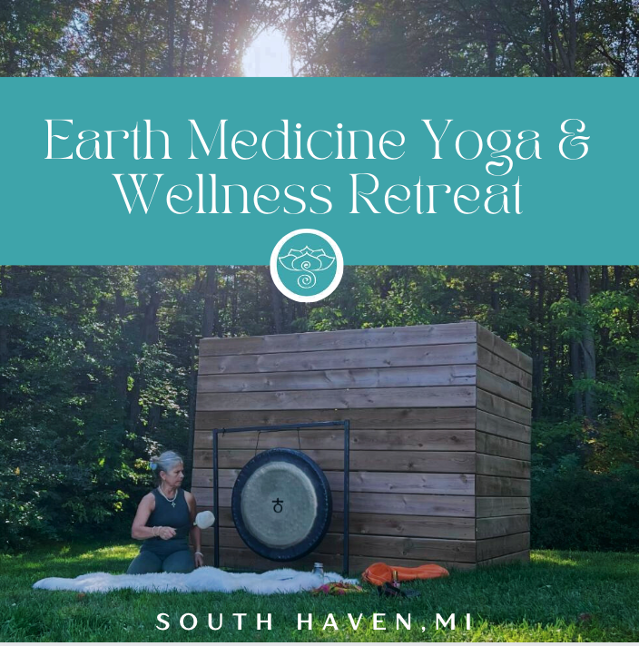
From the start, it was apparent that HME was a special studio that elevated yoga past a physical practice. Plus, our target audience was the type to crave a deeper, more intentional yoga experience. It was clear that we needed to differentiate our messaging from other franchise workout yoga studios.


Website Refresh
With the website’s previous UI, customers were having difficulty locating and purchasing offerings directly on the website, causing missed revenue opportunities. I used the studio’s four offering categories, as well as MindBody Branded Web Tools to create a website experience that fostered ease-of-use and ease-of-purchase, where customers could efficiently find what they were looking for and easily make purchases.
Additionally, keeping our older customer base in mind, I aimed to create an experience that was accessible, intuitive, and beautiful.

Low-Fi Mockup

2. Prototyping

3. High-Fi Mockup
